Informations
Close
Omega CT
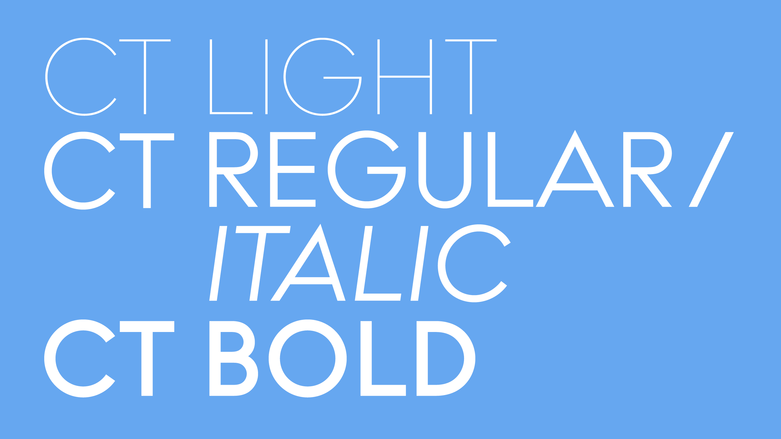
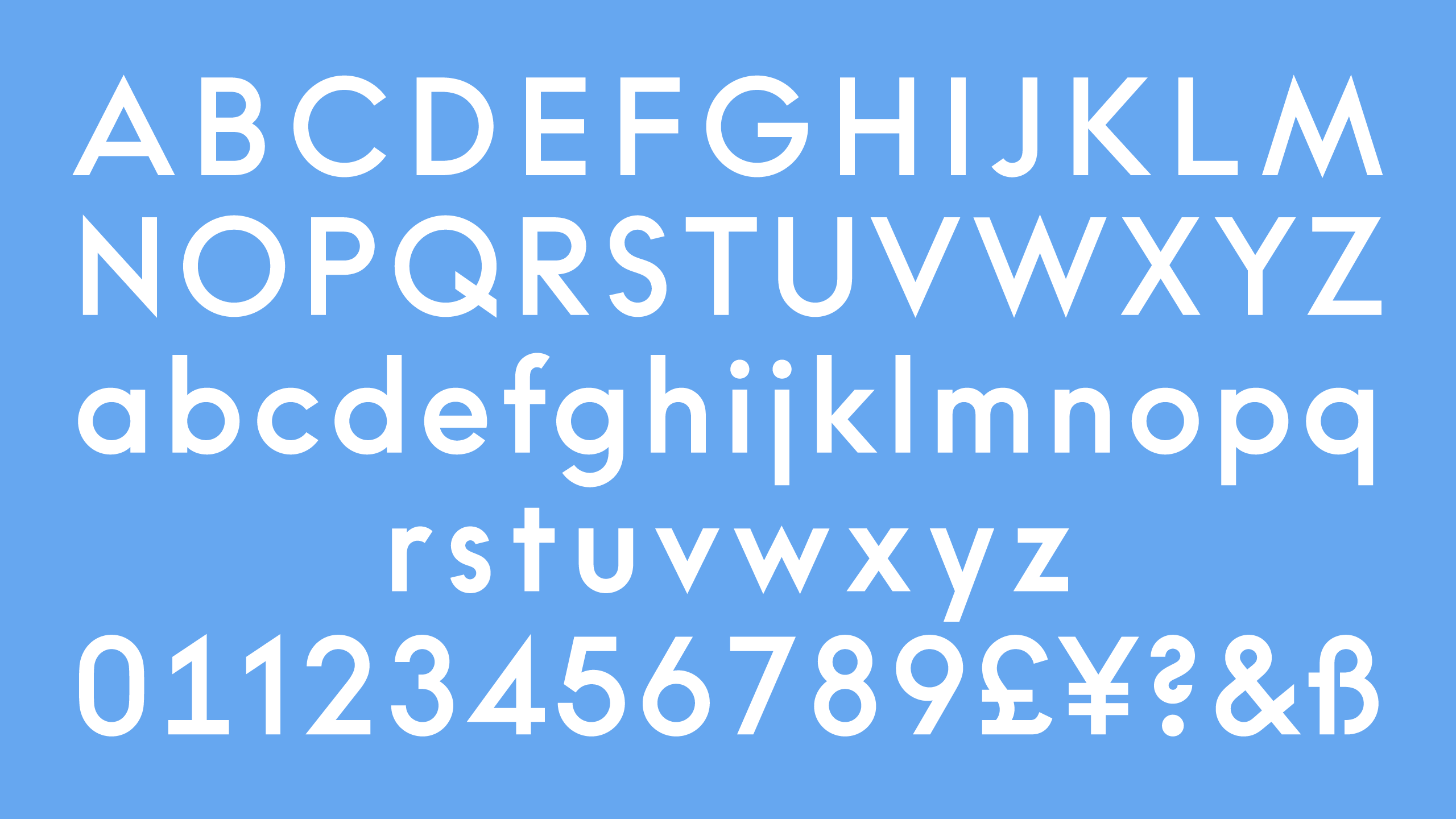
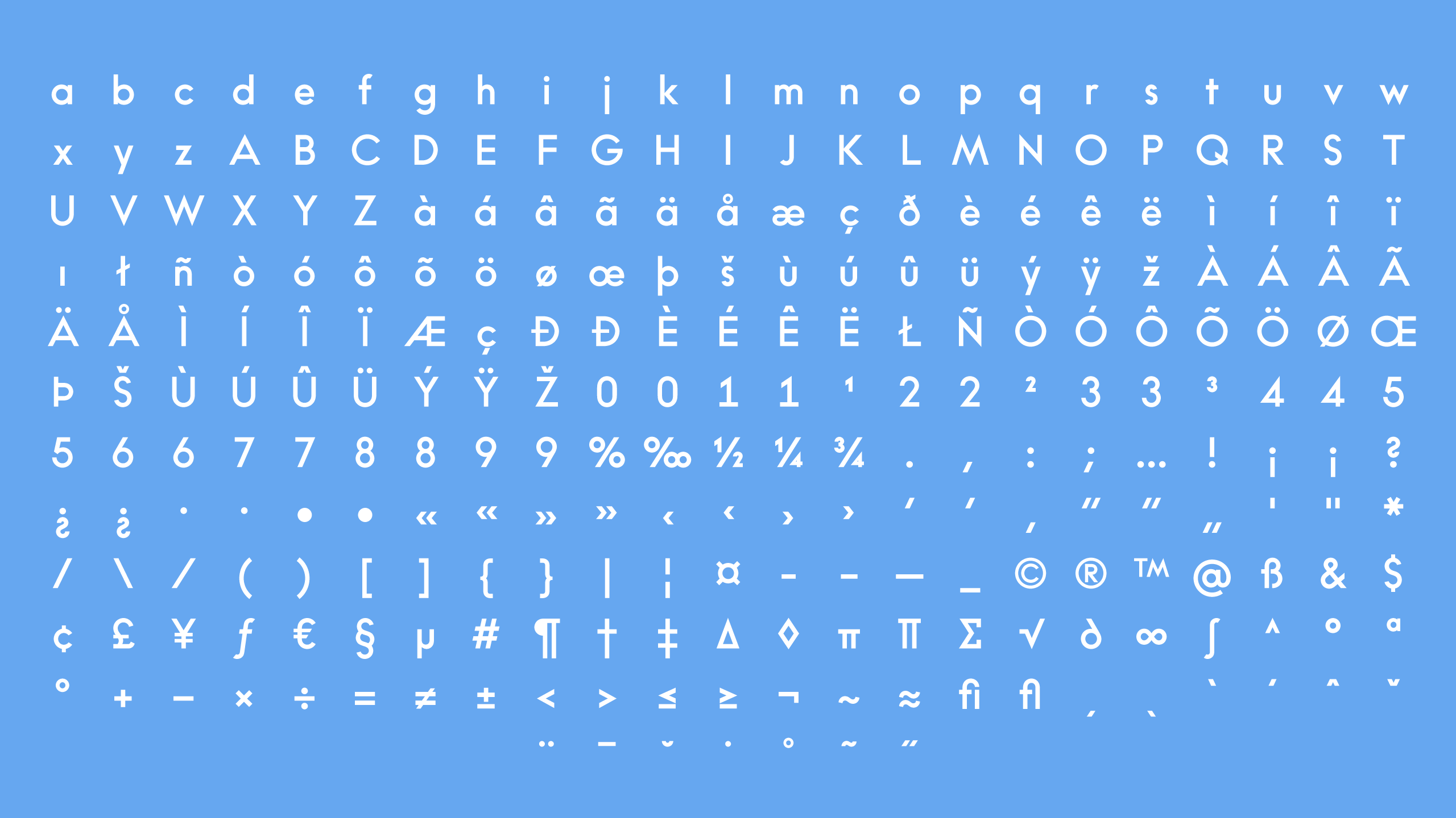
The Omega Corporate Typeface was designed by Aurèle Sack in collaboration with NORM (Zürich) in 2006. It is based on a Futura, used for the Omega identity since the 1940s. Following the direction of the logotype, four styles were created exclusively for the luxury watch brand. Omega CT Bold, Regular, Light and Italic are now used across the entire identity and communication of the brand, ranging from posters and advertising to magazines. The Omega CT typeface was exclusively designed as a corporate typeface and is not available on the market.